You've got data in Google Sheets. You need a dashboard your team or client can actually interact with. And you'd rather not set up Looker to get there.
The dashboard dilemma
Google Sheets has charts. They're fine for personal analysis. But the moment you need to share an interactive view with someone else — a client, a manager, a cross-functional team — those charts fall apart.
The built-in visualisations can't be explored. They don't filter. You can't hand someone a link and say "dig into the numbers" unless you also hand them edit access to the underlying sheet. Which means they can break your formulas, overwrite cells, or just get overwhelmed by rows of raw data they were never meant to see.
So teams reach for BI tools. Looker, Tableau, Power BI. These work — but they come with per-seat licences, setup overhead, and a learning curve that makes them overkill when you just want a clean, shareable view of a spreadsheet.
The gap isn't "can I make a chart?" It's "can I share an interactive, explorable view of my data with people who don't have logins?"
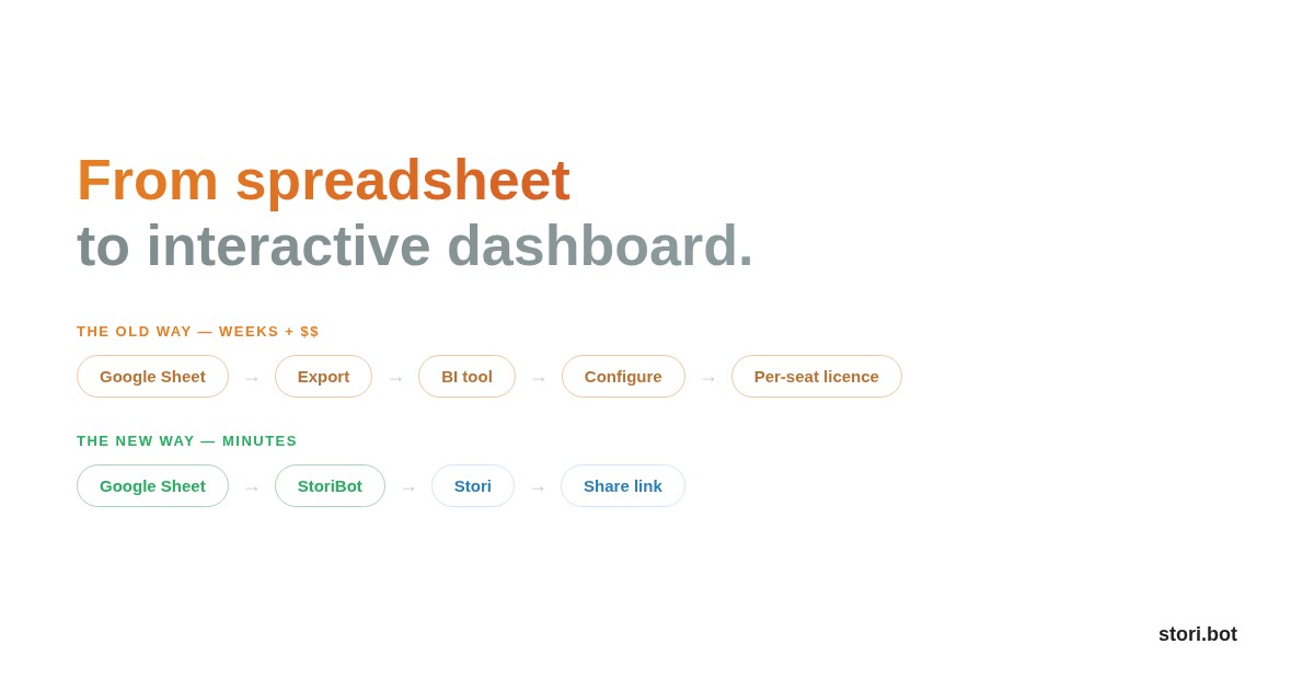
What if you skipped the BI tool entirely?
StoriBot sits in that gap. You share your Google Sheet, describe what the dashboard should show, and the agent builds a series of interactive, full-screen data graphics — a Stori — that anyone can access via a share link. No per-seat pricing. No viewer licences. No training required.
Here's how it works.
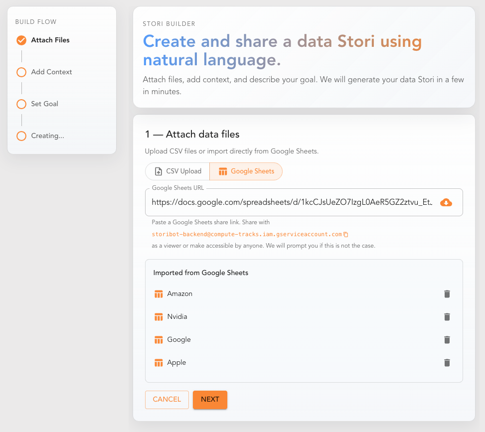
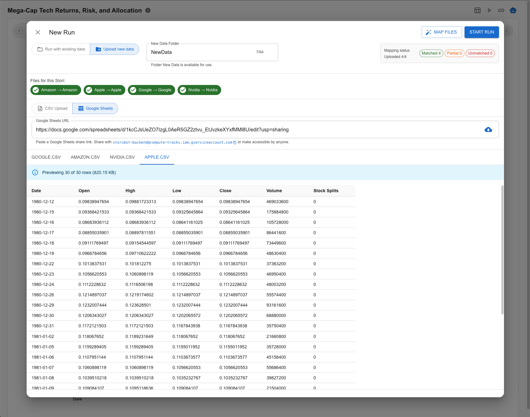
Step 1: Share your Google Sheet
There's no complex integration. Either share your Google Sheet with StoriBot's service account, or make it "Anyone with the link can view." Paste the link into StoriBot, and it reads the data directly.
No OAuth flow. No credentials to manage. No API keys.
If your data spans multiple tabs (say, one tab per month or one tab per region), the agent can pull across all of them.
Why it matters: The connection is live. When the underlying sheet updates and you hit replay, your Stori reflects the change.
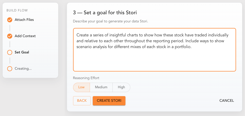
Step 2: Tell the agent what to build
This is the key difference between StoriBot and a drag-and-drop chart builder. You describe the dashboard in plain language:
"Build a dashboard showing monthly revenue by product line, with a comparison to target. Include a regional breakdown that can be filtered by quarter. Highlight any product lines trending below 80% of target."
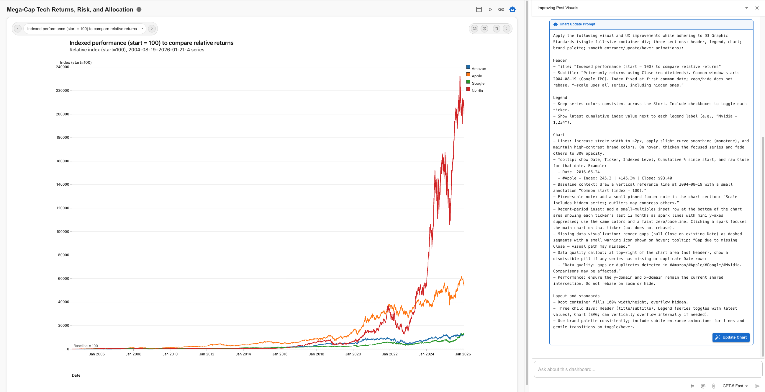
The agent reasons through your data, codes the visualisations, and deploys a series of full-screen data graphics. Charts, infographics, animated data sequences, interactive scenario analysis — each graphic designed to land a single insight. You swipe through them left to right.
This takes about 8–10 minutes. The agent is reasoning through your data and building custom graphics, not dropping numbers into a template.
For a sales dashboard, you might write:
"Show pipeline value by stage as a horizontal bar chart. Then show deals closing this month sorted by value. Flag any deals that have been in the same stage for more than 30 days."
Why it matters: You're describing what decisions the dashboard should support, not which chart type to put in which cell.
Step 3: Interact and refine
Swipe through the graphics. Each one takes up the full screen — designed to land a single point clearly. If something's off, open the chat interface on any graphic and talk to the agent.
"Add a trendline to the revenue graphic." "Break the regional view down by city instead of state." "Make the target comparison a percentage variance, not absolute numbers."
You can share a screenshot or reference specific data points to improve the agent's understanding. From the chat, trigger "update graphic" to refine what's there, or "add graphic" to insert a new one into the sequence.
Why it matters: You're editing intent, not pixels. The agent rebuilds the graphic based on your feedback — you don't touch code or chart settings.
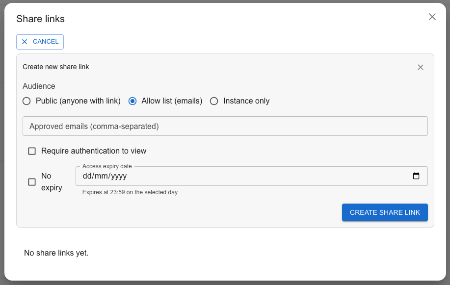
Step 4: Share it — without logins
Generate a share link. You control access:
- Public: Anyone with the link can view the Stori.
- Allow-list: Only specific email addresses can access it.
- Authenticated: Viewers need to sign in.
Each option can be set to expire or remain active indefinitely. Need a static version? Hit the screenshot button to capture any graphic with one click.
Viewers can swipe through the graphics, interact with the data, and explore — but they can't edit the source or see the underlying sheet.
Why it matters: The person who needs to see the data doesn't need a Google account, a BI licence, or your help navigating a spreadsheet. They get a purpose-built view, and you control exactly who sees it.
Step 5: Replay when the data changes
When the numbers update — new week, new month, new quarter — hit "Replay." The agent re-runs against the latest data in your Sheet and produces a fresh Stori.
No rebuilding charts. No updating date ranges manually. No "can you send me the latest version?" emails. Same structure, same standards, new data.
Why it matters: You've turned a recurring dashboard build into a configured, repeatable process. One click to refresh.
When to use this instead of a BI tool
You have a small team. Looker and Tableau shine at scale — hundreds of users, dozens of data sources, complex permissioning. If you're a team of 5–30 and your data lives in Sheets, you don't need that.
Your audience doesn't have logins. Clients, board members, cross-functional partners — the people who need to see dashboards often aren't on your BI platform. Share links solve this instantly.
Your data updates on a predictable cadence. Weekly sales numbers. Monthly financials. Quarterly OKR progress. If the structure stays the same and only the numbers change, a configured agent handles this perfectly.
You need it built today, not next sprint. A BI dashboard often means a ticket in the data team's backlog. A StoriBot dashboard means sharing a Sheet and writing a paragraph.
Try it with your own data
Connect a Google Sheet and build your first interactive dashboard in under five minutes. No licence fees. No setup wizard. No SQL required.
Related reading:
- How to turn a Google Sheet into a client-facing report
- How to share data visualisations without giving everyone a BI login (coming soon)
- Google Sheets vs Tableau for small teams: what you actually need (coming soon)