You've got 10 minutes before a client call and a spreadsheet full of numbers that need to tell a story. StoriBot gets you from raw data to something shareable — fast.
Start with your data
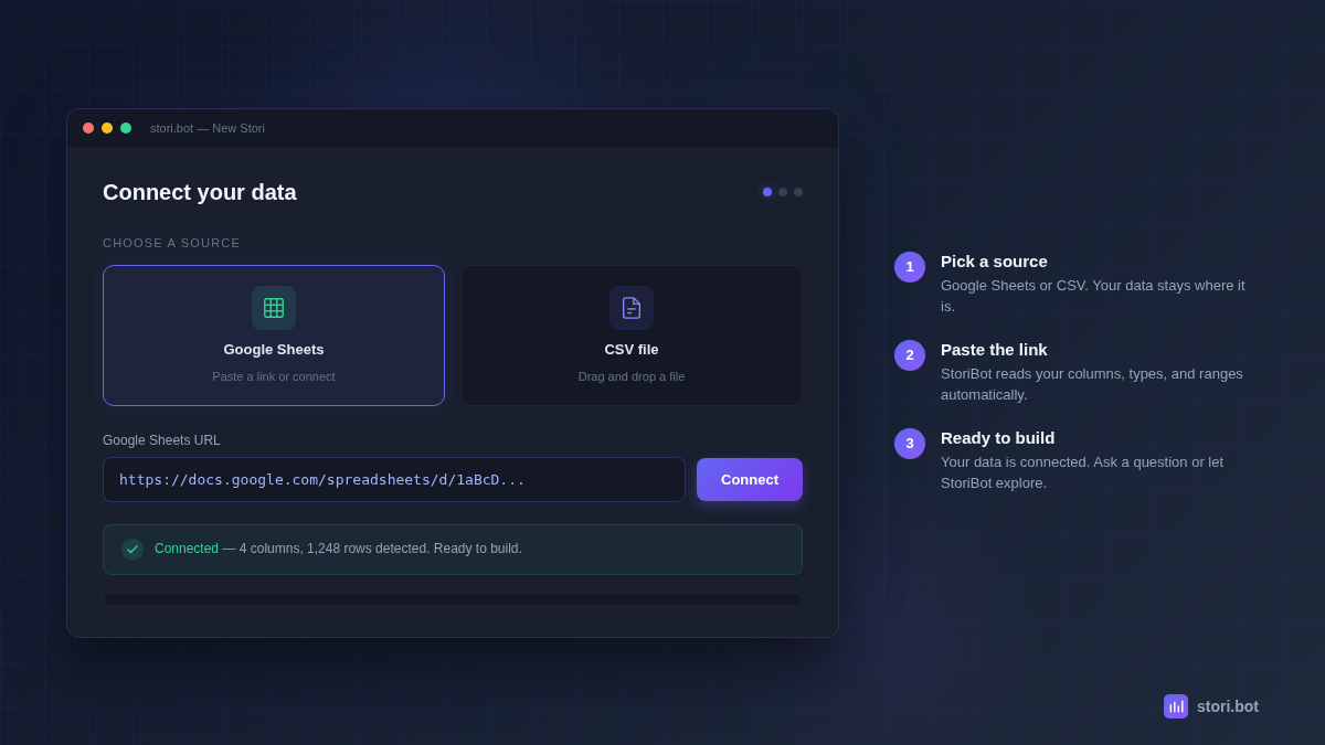
StoriBot works with the data you've already got. Connect a Google Sheet or drop in a CSV. No templates, no database setup, simply connect your data source and go.
Once your data is connected, StoriBot reads your tables, column names, data types, ranges, and relationships. It starts creating your output in the time it takes your coworker to make a coffee.
Connect a Google Sheet: Are you team Google Sheets? Easy, simply paste a link or use the Google Sheets integration to grant read access. Your data stays in your Sheet — StoriBot reads it, it doesn't copy or store it.
Drop a CSV: Leaning more towards CSV? Just give the file a drag and drop into the chat. StoriBot parses it immediately and shows you what it found — columns, row count, data types, any issues it noticed.
Connected your data, but now what?
Once your data is connected, you have two options. Both work. Which one you pick depends on how much you want to know.
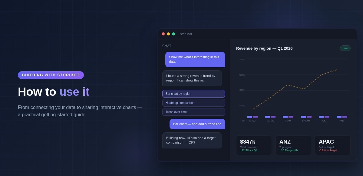
"Show me what's interesting"
If you're not sure where to start — or you want StoriBot to do the exploratory work — just ask:
"Show me what's interesting in this data."
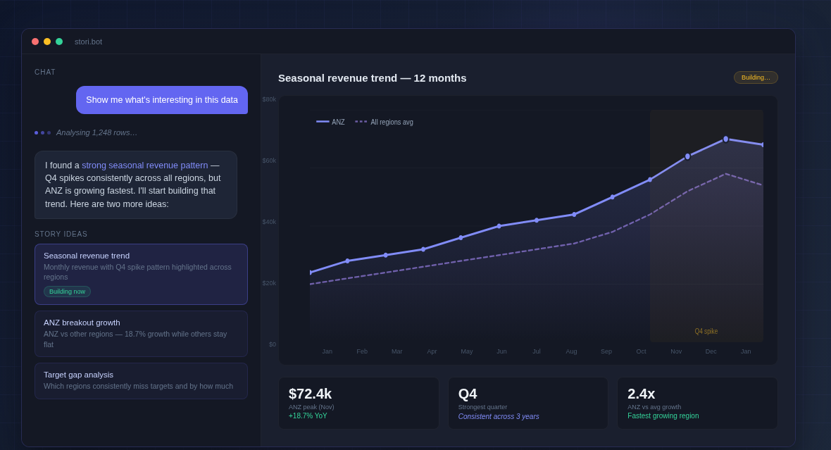
StoriBot analyses your data, identifies the most compelling story it can find, and starts building immediately. While the first chart renders, it proposes two or three more ideas for you to choose from. You pick what resonates, and it builds from there.
Say you're a marketing agency pulling campaign performance from a client's Google Sheet. You've got 12 months of ad spend, impressions, and conversions across six channels. You could spend an hour deciding what to chart first — or you could let StoriBot find the story. It might spot that one channel is driving 60% of conversions at 20% of the spend. That's the insight your client needs, and you didn't have to hunt for it.
"Make me a bar chart of sales by region"
If you know what you want, just say so. Be as specific as you like:
"Make me a bar chart of sales by region."
"Create a scatter plot of revenue vs headcount, coloured by department."
"Show me monthly revenue trends for the last 12 months with a target line at $50k."
StoriBot confirms what you've asked for, suggests one small enhancement that might make the output better — a trend line, a smarter grouping, a comparison that reveals something the basic chart wouldn't — then starts building. It respects your vision while elevating the output.
You're never locked in. If the suggestion doesn't appeal, ignore it and StoriBot builds exactly what you asked for.
Connect Google Sheets → · See example Stories →
The options interface
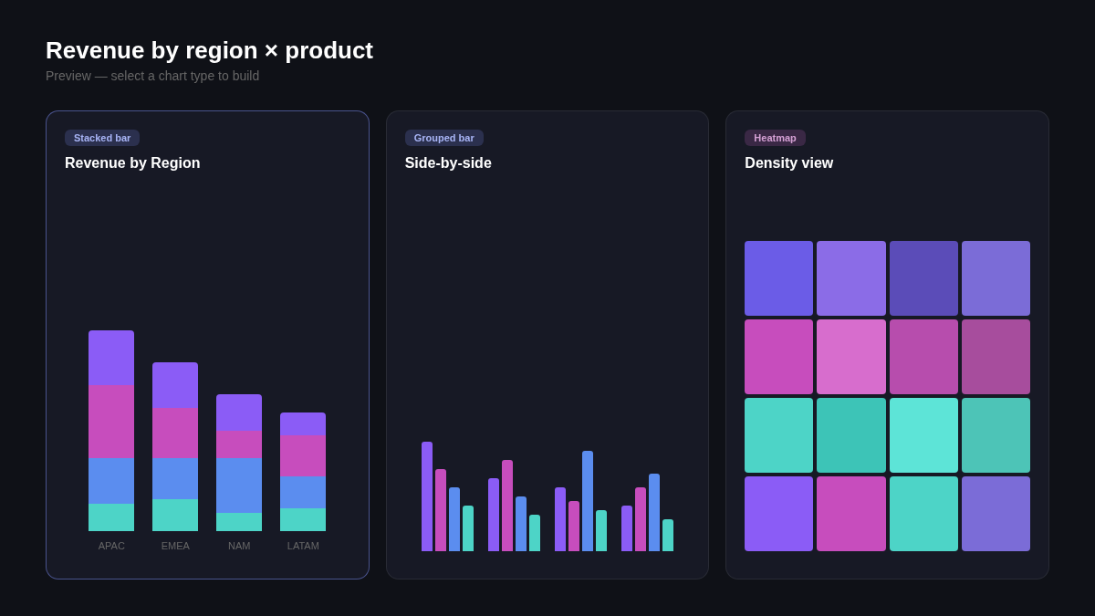
You've asked for a revenue breakdown by region and product. There are three sensible ways to show that. Rather than guessing which one you want, StoriBot presents the options as clickable choices — each one concrete, not a vague question.
StoriBot: I can show this as:
- A stacked bar chart (revenue by region, broken down by product)
- A grouped bar chart (side-by-side comparison)
- A heatmap (density view across both dimensions)
Which works best for your audience?
Pick one, or type your own idea. Not sure? Go with the one that sounds closest — you can always change it later!
Permission before changes
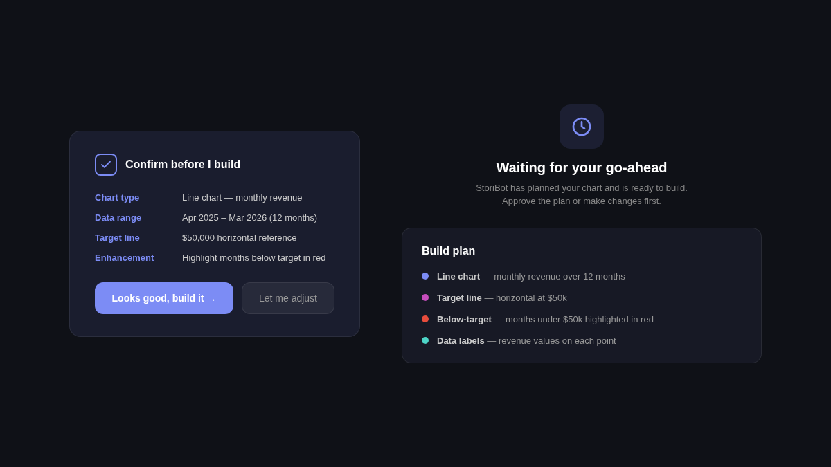
StoriBot won't surprise you...Before it creates or modifies anything, it describes exactly what it plans to build — which data, what type of chart, what story it'll tell — it then waits for your go-ahead.
StoriBot: I'll create a line chart showing monthly revenue for the past 12 months, with a horizontal target line at $50k. I'll highlight months that fell below target in red. Sound good?
You stay in control of your data. If you want something different, just tell StoriBot and it will adjust before building.
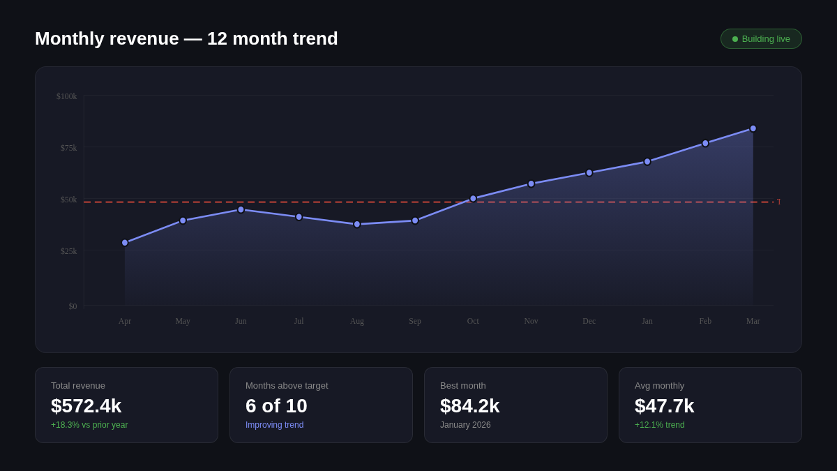
Watch it build
You don't wait for StoriBot to finish and then see the result. Your Stori updates live as it works. Charts appear, refine, and sharpen in front of you.
This changes how you work with it. Instead of writing a detailed specification and hoping the output matches, you watch the chart take shape and course-correct as it builds. "Actually, make that a horizontal bar chart." "Can you add data labels?" "The colours are too similar — use more contrast."
It's a conversation, not a form submission.
What you end up with
The output is a Stori — a set of full-screen, interactive data graphics your audience can swipe through. Each one runs in the browser. No login required, nothing to install.
You share it with a link. Your team, your client, your board — they can open the link and explore the data Stori you built.
When your data source updates, hit replay. StoriBot re-runs against the latest numbers and produces a fresh Stori. Same share link, updated automatically. Configure once, replay whenever new data lands — no need to rebuild the same charts every month.
Try it with your own data
Connect a Google Sheet and create your first Stori in under five minutes. Start with "show me what's interesting" or tell it exactly what you want. Either way, you'll have something shareable before your coffee gets cold.
Connect Google Sheets → · See example Stories →
Related reading: